FusionCharts vs. Highcharts vs. amCharts | Compare JavaScript Charting Libraries →
FusionCharts
  • Products

    • FusionCharts Suite XT

    • FusionTime

    • FusionExport

    • FusionGrid

    • Yellowfin BI & Analytics

  • Developer

    • Dev Center (Docs)

    • Integrations

  • Important Links

    • Dashboards

    • Data Stories

    • Contact Sales

    • Pricing

    • Download

    • Support

    • Ask FusionDev AI

    • Blog

    Search ChartsNewAsk FusionDev AI
      • FusionCharts Suite XT
        • Overview
        • Charts and Maps gallery
          • Overview
          • FusionCharts XT
            • Column & Bar Charts
              • Overview
              • Simple column
              • Grouped column with multiple series
              • Grouped column with scrolling
              • Simple bar
              • Grouped bar with multiple series
              • Column in 3D
              • Grouped column in 3D with multiple series
              • Bar in 3D
              • Grouped bar in 3D with multiple series
              • Bar chart with custom labels as annotations
              • Overlapping Columns
              • Overlapping Bars
              • Grouped bar with scrolling
            • Line & Area Charts
              • Overview
              • Simple line
              • Line with multiple series
              • Line with zooming & panning
              • Line with scrolling only
              • Line with multiple axes & series
              • Simple area
              • Area with multiple series
              • Area with scrolling
              • Simple spline
              • Spline with multiple series
              • Simple spline-area
              • Spline-area with multiple series
              • Step-line
            • Pie & Donut Charts
              • Overview
              • Pie in 2D
              • Donut in 2D
              • Pie in 3D
              • Donut in 3D
              • Nested Pie in 2D
            • Stacked Charts
              • Overview
              • Stacked columns
              • Stacked columns with scrolling
              • 100% stacked columns
              • Grouped stacked columns
              • Stacked columns with negative values
              • Stacked columns in 3D
              • 100% stacked columns in 3D
              • Stacked bars
              • Stacked bars in 3D
              • Stacked area
              • Stacked bars with scrolling
              • Grouped stacked columns with scrolling
            • Combination Charts
              • Overview
              • Same axis - Column, line & area
              • Same axis - Column & line/area, with scrolling
              • Dual axis - Column & line/area, with scrolling
              • Dual axis - Line with zooming & panning
              • Same axis - Stacked columns & line
              • Same axis - Column & line, in 3D
              • Same axis - Column, line & area, in 3D
              • Same axis - Stacked columns & line, in 3D
              • Dual axis - Column, line & area
              • Dual axis - Stacked columns & line, in 3D
              • Dual axis - Grouped stacked columns & line
              • Dual axis - Column, line & area, in 3D
              • Dual axis - Grouped stacked columns with negative values & line
              • Dual Axis - Grouped stacked columns & line with scrolling
              • Dual axis - Stacked columns & line
              • Dual axis - Stacked area & line
              • Dual axis - Column, line & area, in 3D
            • Bubble & Scatter (XY) Charts
              • Overview
              • Simple bubble
              • Bubble with quadrants
              • Simple Scatter
              • Scatter with multiple series
              • Scatter with zooming support
              • Scatter with selection of points on canvas
            • Market Share Charts
              • Overview
              • Market share in actuals
              • Market share as %
            • Pareto Charts
              • Overview
              • Simple Pareto
              • Pareto with dual axis
              • Pareto in 3D
          • FusionWidgets XT
            • Gauges & KPIs
              • Overview
              • Rating Meter
              • Speedometer
              • Quarter gauge
              • Gauge with trend
              • Linear Scale
              • Linear Scale with colored categories
              • Cylinder fill
              • Horizontal LEDs
              • Vertical LEDs
              • Thermometer display
              • Bulb indicator
            • Gantt / Project Charts
              • Overview
              • Simple gantt
              • With progress indicators for each task
              • With task owner listed & multi-level dates
              • Grouped view of tasks
              • Showing planning vs actuals
              • Weekly task distribution
              • Hourly tasks
              • Milestone indicators
              • Showing dependent tasks
              • Machine operating schedule
            • Funnel & Pyramid Charts
              • Overview
              • Simple funnel
              • Funnel with % values
              • Funnel in 3D
              • Funnel to show part-to-whole
              • Simple pyramid
              • Pyramid with % values
              • Pyramid in 3D
            • Bullet & Spark (Micro) Charts
              • Overview
              • Horizontal Bullet Graph
              • Horizontal Bullet with dot
              • Vertical Bullet Graph
              • Simple sparkline
              • Sparkline with period indicators
              • Sparkline with dots only
              • Simple spark-columns
              • Spark-columns with period indicators
              • Win/loss micro charts
            • Self-updating (Real-time) charts
              • Overview
              • Line
              • Dual axis - Line
              • Area
              • Stacked Area
              • Column
              • Stacked Column
              • Speedometer
              • Cylinder fill
              • LED
              • Thermometer
              • Bulb
          • PowerCharts XT
            • Heat & Tree Maps
              • Overview
              • Heat map with numeric values
              • Heat map with percent data
              • Heat map using variants of single color
              • Heat map with additional labels per quadrant
              • Heat map with categorical values & numeric mapping
              • Heat map to show scores
              • Heat map to show ranking
              • Simple tree map
              • Tree map with breadcrumb
              • Tree map with squarified layout
              • Tree map with slice & dice layout - vertical slicing
              • Tree map with slice & dice layout - horizontal slicing
              • Tree map with slice & dice layout - alternate slicing
            • Radar (Spider Charts)
              • Overview
              • Simple radar
              • Radar with multiple series
            • Waterfall / Cascade Charts
              • Overview
              • Simple waterfall
              • Without cumulative sum
            • Visually Editable Charts (What-if analysis)
              • Overview
              • Editable column chart
              • Editable line chart
              • Editable area chart
              • Editable gauge
              • Editable linear scale
            • Graph visualization / Node diagrams
              • Overview
              • Simple graph layout
              • Station map chart
              • Network visualization
              • Sequence flow visualization
              • Add/remove nodes from chart
              • Org Chart Visualization
            • Statistical Charts
              • Overview
              • Simple box and whisker
              • Box and whisker with mean and outliers
              • Box and whisker with connected mean
              • Box and whisker with mean deviation
              • Scatter (XY) with error bars
              • Line with error bars
              • Column with error bars
              • Line with log axis
              • Column with log axis
              • Column with inverted axis
              • Area with inverted axis
              • Line with inverted axis
            • Stock Charts
              • Overview
              • Simple candlestick
              • Candlestick with price plotted as line
              • Candlestick without volume panel
              • Candlestick with custom trends
              • Candlestick with split/dividend markers
              • Kagi Chart
            • Sankey Diagram
              • Overview
              • Simple Sankey Diagram
              • Vertical Sankey
              • Sankey with No Nodes
            • Sunburst Charts
              • Overview
              • Simple Sunburst
              • Sunburst with multiple roots
            • Chord Diagram
              • Overview
              • Simple Chord
              • Simple Chord with Blend
              • Chord with Self-links
              • Chord with large number of nodes
          • FusionMaps XT
            • Examples
              • Sale of Cigarettes in Europe
              • Population growth world-wide
              • WeWork Office Locations
              • Shipping Routes in US
              • Average temperature of US States
              • Television exposure by DMA in US
              • Fertility rates in Europe
              • Greenhouse gas emissions (with drill-down)
            • Features
              • Setting custom labels
              • Drill-down from map to chart
              • Showing specific regions only
              • Custom tool-tips
              • Overlay icons on maps
              • Overlay icons with connector lines
            • All Maps (2,000+)
        • Feature Gallery
          • Overview
          • Data Plots
          • Chart Titles/Labels
          • Number Formatting
          • Legends
          • Tooltips
          • Trendlines
          • Axis and Gridlines
          • Drill Down
          • Export Charts
          • Zoom/Scroll/Pan
          • Chart Loading Config
          • Chart Branding
          • Events/API
          • Annotations
          • Space Management
        • Chart Guides
          • Line Chart
          • Area Chart
          • Bar Chart
          • Column Chart
        • Integrations
          • Overview
          • Front-end Integrations
            • React
            • Angular (for Angular 2 or above)
            • jQuery
            • Vue.js
            • Ember
            • AngularJS (for Angular 1.x)
            • React Native
            • Svelte
            • Flutter
            • Blazor
          • Back-end Integrations
            • ASP.NET
            • PHP
            • Java
            • Django
            • Ruby on Rails
        • Extensions
          • Accessibility
            • Overview
            • Usage Guide
      • FusionTime
        • Overview
        • Examples
          • Overview
          • Simple time-series
            • Line chart with time axis
            • Plotting multiple series on time axis
            • Column and line combination on time axis
            • Dual Y-Axis
            • Y-Axis on right side
            • Log axis with time-series
            • Log Axis with different base
            • Plotting missing data
            • Join missing data
            • Join missing data with styled line
          • Multivariate time-series
            • Plotting two variables (measures)
            • Different plot type for each variable (measure)
            • Y-Axis on right side of one of the canvas
            • Chart with variable canvas height
          • High volume data
            • Time series chart with a million data points
          • Standard chart types
            • Column chart with time axis
            • Stacked column chart with time axis
            • Grouped column chart
            • Area chart with time axis
            • Smooth area chart with time axis
            • Stacked area chart with time axis
            • Overlapping area chart with time axis
            • Customized area chart with time axis
            • Dashed line chart with time axis
            • Step line chart with time axis
            • Spline plot with time axis
            • Area Range Chart
            • Column Range Chart
          • Stock chart types
            • Interactive Candlestick chart
            • Interactive OHLC Chart
            • Interactive candlestick chart with y-axis on right
            • Stock chart with volume
            • Annotations on stock chart
            • Real-time OHLC chart
            • Real-time candlestick chart
          • Annotating data
            • Annotating single data point
            • Annotating multiple data points
            • Annotations on a multivariate chart
            • Annotations with pin type data marker
          • Event overlays
            • Single event overlay
            • Date range event overlay
            • Full line single event overlay
            • Full band date range event overlay
            • Single event overlay in multivariate
            • Date range event overlay in multivariate
          • Configurable features
            • Adding a reference line
            • Dashed reference line
            • Multiple reference lines on same chart
            • Reference line in multivariate chart
            • Adding a reference zone
            • Multiple reference zones on same chart
            • Reference zone in multivariate chart
            • Representing predictive data
            • Styled standard range selector
            • Styled custom range selector
            • Specify initial time interval
            • Time format on time axis
            • Time format in tooltip
            • Data binning on time axis
            • Maximum data bin on time axis
            • Minimum data bin on time axis
            • Enabling clipping of specific date
            • Enabling cyclic weekend clipping
            • Enable Auto-axis clipping when null data is present
            • See unformatted data values
            • Round off data values
            • Enabling grid bands
            • Disabling Legend
            • Initially hidden legend item
            • Customize Legend Position
            • Disabling time navigator
            • Specify time navigator height
            • Exportable time series charts
            • Customizing caption and sub-caption position
            • Weekly Data binning on time axis
          • Working with events & methods
            • Data plot hover mouse event
            • Data plot click mouse event ‎
            • Binning API methods
            • Selection change event on OHLC chart
            • Selection change event on stacked column chart
            • Export chart using API method
            • Update chart using API methods
            • Add data to chart in real-time
            • Update data in real-time
            • Self updating chart using Rest API
            • Change Plot Type
      • FusionExport
        • Overview
      • Showcase
        • Dashboards
          • Overview
          • Smart Energy Monitoring Dashboard
          • Sales Management Dashboard
          • SaaS Dashboard
          • Wealth Management Dashboard
          • Expense Dashboard of US Dept. of Veteran Affairs
          • Investment Portfolio Dashboard
          • Technology Dashboard
          • Pediatrics Center Dashboard
          • Marketing Dashboard
          • Web Series Dashboard
          • Manufacturing Quality Dashboard
          • Shipment Analysis Dashboard
          • Venture Financing Dashboard
          • Online Retail Dashboard
          • Sales Opportunity Dashboard
          • Google Analytics Web Dashboard
          • Smart Weather Dashboard
          • Real-time Twitter hashtag tracker
          • Sales Performance Dashboard (Mobile)
          • Sales & Collaboration Dashboard
          • Sales Performance Tracker (3D)
          • Realty Information Dashboard
          • Membership Monitoring Dashboard
          • Automotive Manufacturing Management Dashboard
          • Healthcare Expenditure Dashboard
          • Business Operation Monitoring Dashboard
          • Flight Planner
          • Music Player with Graphic Equalizer
          • Real-time Patient Monitoring Dashboard
          • Football League Dashboard
          • Product Ratings Dashboard
        • Data Stories
          • Overview
          • Gasoline Prices around the World
          • World’s Top Cities for People and Planet
          • Summers are Getting Hotter
          • Immigration to the US
          • How Trump Compares with Past Presidents
          • What is Really Warming the World
          • Unemployment Rate in the USA
          • How Americans Die
          • Clean Water Access around the World
          • Twelve Global Economic Indicators to Watch
          • Ratios of Inequity
          • Performance of Tech IPOs
          • Understanding the World Better
          • Jobs Gain & Loss
          • Popularity of Donald Trump
      • FusionGrid
        • Overview
        • Examples
          • Column Filter
          • Data Export
          • Row Selection
          • Column Grouping
          • Real-time Data update
          • Row Sorting
          • Search/Quick filter
          • Row Animation

      FusionCharts Suite XT: Explore 100+ Charts and 2000+ Maps

      FusionCharts provides over 100+ charts and 2000+ maps. With extensive documentation, a consistent API, and a range of customization options - FusionCharts is the most comprehensive JavaScript charting library that is loved by 750,000 developers across the globe. FusionCharts Suite XT includes FusionCharts XT, FusionWidgets XT, PowerCharts XT, and FusionMaps XT.

      All our charts are designed to work on JavaScript, React, Vue, Angular, jQuery, Ember, etc. Head to these charts to check out the code and visualization of each of these frameworks.

      FusionCharts XT

      With 50+ chart types, FusionCharts XT consists of the most commonly used charts like column, line, and pie for your reports and dashboards.

      Explore 50+ Charts

      FusionWidgets XT

      From Gauges and KPIs to funnel and pyramid charts, FusionWidgets XT makes your dashboards and monitors a lot more insightful.

      Explore 40+ Widgets

      PowerCharts XT

      With the inclusion of heat & treemaps, radar, and statistical charts, PowerCharts XT is a set of advanced charting widgets for domain-specific usage.

      Explore 10+ Charts

      FusionMaps XT

      Plot your crucial business data like revenue by regions with over 2000 data-driven maps that are included in FusionMaps XT.

      Explore 2000+ Maps

      FusionCharts XT

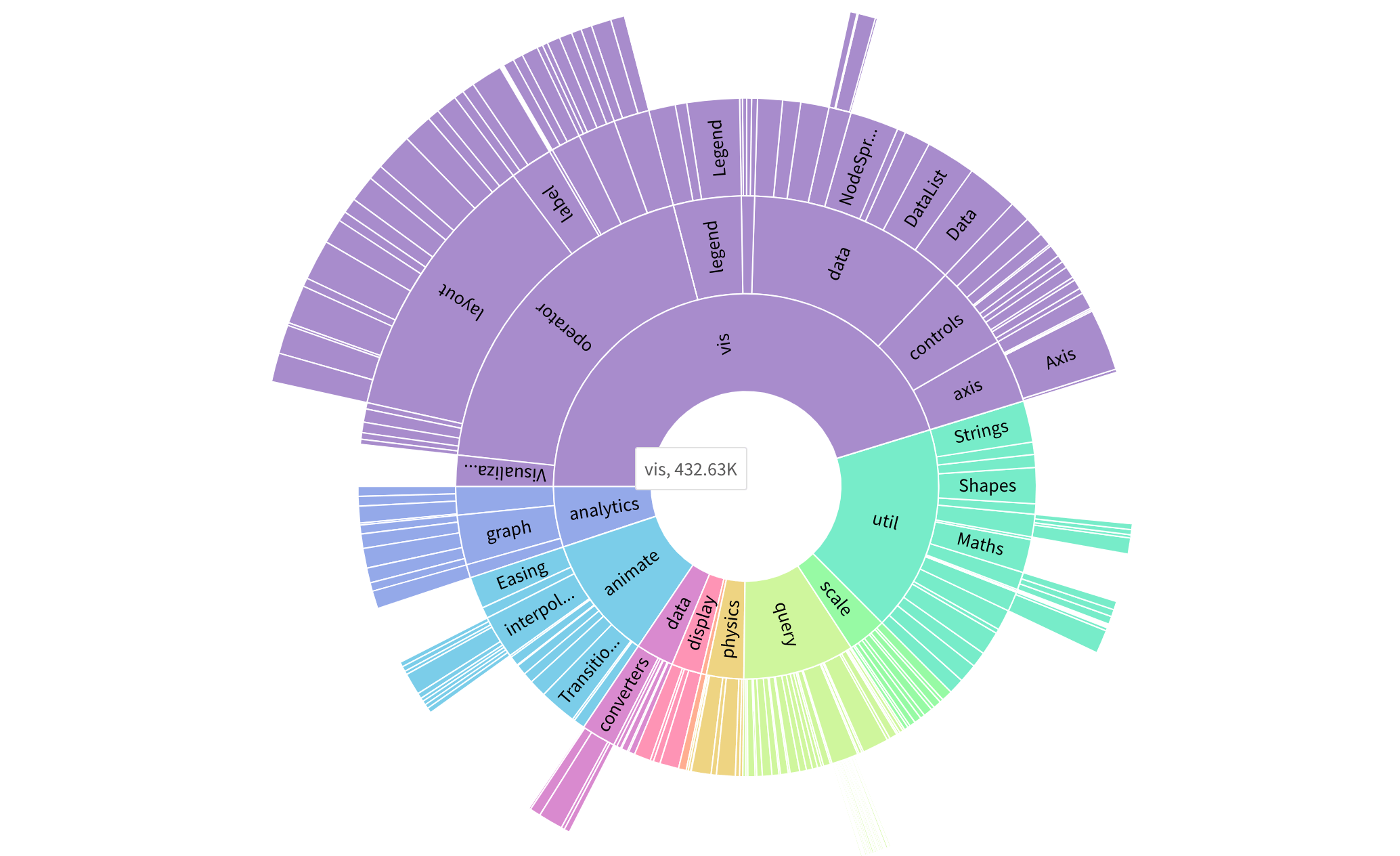
      FusionCharts XT is our flagship product that consists of 50+ chart types like Line, Area, Column, Bar and more. A perfect addition to your reports, dashboards, surveys, monitors and analytics. Click on a chart to see it in action.

      FusionCharts Chart Gallery - Line Column Bar Pie

      Column & Bar Charts

      Compare the values of individual data points with another

      FusionCharts Chart Gallery - Line Column Bar Pie

      Line & Area Charts

      Show trends, performances and comparisons of multiple parameters and axes with zoom and scroll functionalities

      FusionCharts Chart Gallery - Line Column Bar Pie

      Pie & Donut Charts

      Show the breakdown of data into its constituents, i.e. parts of a whole

      FusionCharts Chart Gallery - Line Column Bar Pie

      Stacked Charts

      Break data sets into their constituents, and also compare as a whole

      FusionCharts Chart Gallery - Line Column Bar Pie

      Combination Charts

      Combine two or more chart types in a single chart

      FusionCharts Chart Gallery - Line Column Bar Pie

      Bubble & Scatter (XY) Charts

      Both the axes on the chart are numeric axes, with an option for third in the bubble chart

      FusionCharts Chart Gallery - Line Column Bar Pie

      Market Share Charts

      Show any data pertaining to market analysis

      FusionCharts Chart Gallery - Line Column Bar Pie

      Pareto Charts

      Show any data following the 80-20 rule

      FusionWidgets XT

      FusionWidgets XT makes your KPIs and real-time data in dashboards, monitors and reports more insightful with widgets like Gauge and Speedometer. Click on a chart type to see it in action.

      FusionCharts Chart Gallery - Line Column Bar Pie

      Gauges & KPIs

      KPI gauges like Angular, Linear, LED, bulb and more

      FusionCharts Chart Gallery - Line Column Bar Pie

      Gantt / Project Charts

      Specialized chart for planning and scheduling projects

      FusionCharts Chart Gallery - Line Column Bar Pie

      Funnel & Pyramid Charts

      Show progressive and hierarchical data in funnels and pyramid-like structures

      FusionCharts Chart Gallery - Line Column Bar Pie

      Bullet & Spark (Micro) Charts

      Word-sized variations of bar and line charts to compare targeted vs achieved values for dense data

      FusionCharts Chart Gallery - Line Column Bar Pie

      Self-updating (Real-time) charts

      Column, line and area charts that update automatically every 'n' seconds

      PowerCharts XT

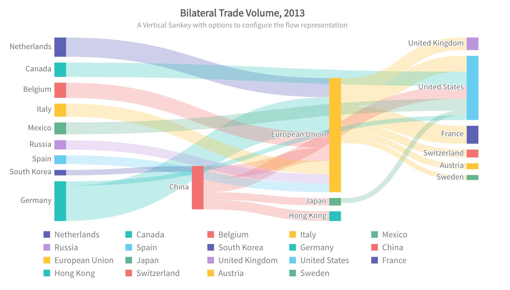
      PowerCharts XT is a set of advanced charting widgets like Heatmaps, Radar or Node graphs for domain specific usage. Click on a chart type to see it in action.

      FusionCharts Chart Gallery - Line Column Bar Pie

      Heat & Tree Maps

      Visual and tabular representation of complex data with color ranges having drill-down functionalities

      FusionCharts Chart Gallery - Line Column Bar Pie

      Radar (Spider Charts)

      Compare multiple entities based on different features

      FusionCharts Chart Gallery - Line Column Bar Pie

      Waterfall / Cascade Charts

      Show how a value increases or decreases to come to a final value

      FusionCharts Chart Gallery - Line Column Bar Pie

      Visually Editable Charts (What-if analysis)

      Offers visual modification of charts where data points can be selected by end users to draw real-time insights

      FusionCharts Chart Gallery - Line Column Bar Pie

      Graph visualization / Node diagrams

      Diagramming tool for network diagrams & process flow diagrams

      FusionCharts Chart Gallery - Line Column Bar Pie

      Statistical Charts

      Show error, deviations and skews in batches of data, also built in with log and inverse axes

      FusionCharts Chart Gallery - Line Column Bar Pie

      Stock Charts

      Plot any kind of stock data like equity/commodity prices in an interactive manner

      FusionCharts Chart Gallery - Line Column Bar Pie

      Sankey Diagram

      Sankey diagrams are used to visualise "flow" of material, energy and cost, shown proportionally to the flow quantity.

      FusionCharts Chart Gallery - Line Column Bar Pie

      Sunburst chart

      Sunburst chart is typically used to visualise hierarchical data structures, with part to whole relationships in data depicted, additionally.

      FusionCharts Chart Gallery - Line Column Bar Pie

      Chord diagram

      A Chord diagram is a graphical method of displaying the inter-relationships (flow or connection) between relatable entities in a circular layout.

      FusionMaps XT

      FusionMaps XT has over 2000+ geographical maps, including all countries, US states, and regions in Europe for plotting business data like revenue by regions, employment levels by state and office locations.

      FusionCharts Chart Gallery - Line Column Bar Pie

      Sale of Cigarettes in Europe

      FusionCharts Chart Gallery - Line Column Bar Pie

      Population growth world-wide

      FusionCharts Chart Gallery - Line Column Bar Pie

      WeWork Office Locations

      FusionCharts Chart Gallery - Line Column Bar Pie

      Shipping Routes in US

      FusionCharts Chart Gallery - Line Column Bar Pie

      Average temperature of US States

      FusionCharts Chart Gallery - Line Column Bar Pie

      Television exposure by DMA in US

      FusionCharts Chart Gallery - Line Column Bar Pie

      Fertility rates in Europe

      FusionCharts Chart Gallery - Line Column Bar Pie

      Greenhouse gas emissions (with drill-down)

      The demo charts on the FusionCharts website are provided for illustrative purposes only.
      Explore
      • Chart Gallery
      • Time-series Charts
      • Map Gallery
      • Data Stories
      • Dashboards
      • FusionExport
      • FusionGrid
      Integrations
      • Angular
      • Vue
      • React
      • jQuery
      • PHP
      • ASP.NET
      • Explore all Integrations
      Developers
      • Dev Center (Docs)
      • Integrations
      • Version History
      • Forum
      Pricing
      • Pricing and Plans
      • Locate a Reseller
      • Support And Upgrades for Older Licenses
      • Login to Product Update Center
      Resources
      • Whitepapers
      • Charting Best Practices
      • Chart Primers
      • Dashboard Primers
      • Developers
      • Blog
      Company
      • Customers
      • Partners
      • About Us
      • Contact Us
      • Careers
      • Legal
      • Privacy Policy
      © 2025 FusionCharts - An Idera, Inc. Company. All Rights Reserved.